Accessibility Statement
Feature Detail
Description
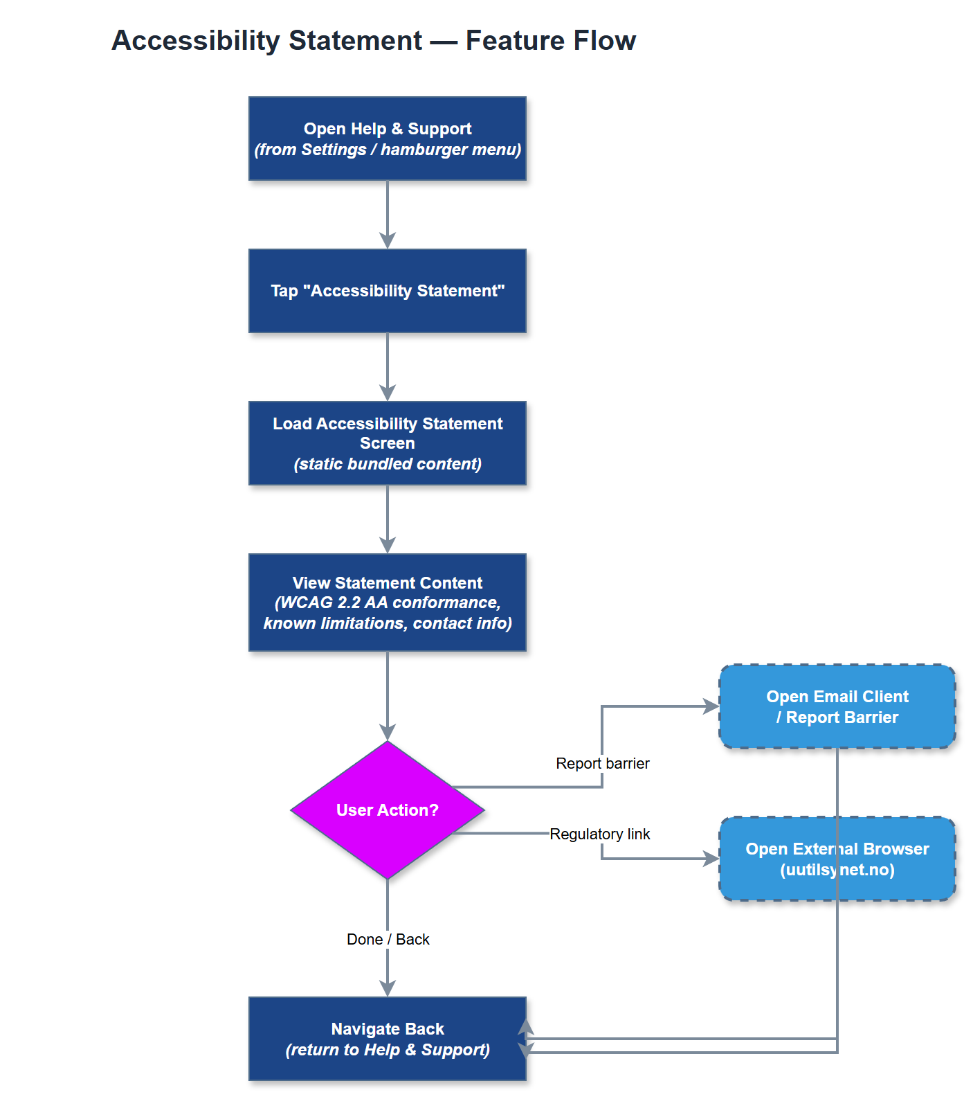
This feature provides a dedicated in-app screen displaying the Meander platform's formal accessibility statement, outlining conformance to WCAG 2.2 Level AA, known limitations, and contact information for reporting accessibility barriers. The screen serves both as a transparency document for users with disabilities and as a formal compliance artifact required by Norwegian accessibility regulations for digital services. It communicates the organization's commitment to inclusive design and provides a feedback pathway for users who encounter accessibility issues.
User Flow
Analysis
Norwegian public-facing digital services and services used by organizations receiving public funding are subject to the Norwegian Regulations on Universal Design of ICT (forskrift om universell utforming av IKT), which mandates publication of an accessibility statement for covered services. Given that NHF, Blindeforbundet, HLF, and Barnekreftforeningen all receive Bufdir funding, Meander must meet this obligation. Beyond compliance, publishing an accessibility statement signals to users with disabilities that their needs are taken seriously, reinforcing the trust required to onboard volunteers who may themselves have significant disabilities. It also establishes a formal channel for reporting gaps, enabling continuous improvement of accessibility quality.
The accessibility statement screen should follow the same static-content pattern as the privacy policy screen, rendering structured text with clear headings for conformance status, known limitations, and contact information for accessibility feedback. The content should reference WCAG 2.2 Level AA as the conformance target and include the date of the last accessibility review. The screen must itself be fully accessible - a common anti-pattern is an inaccessible accessibility statement - so all headings must use semantic structure, links must have descriptive labels, and the layout must reflow correctly at high text scales. The statement should be linkable from the onboarding flow and the Help & Support section.
Components (33)
Shared Components
These components are reused across multiple features
Service Layer (9)
Data Layer (12)
Infrastructure (7)
User Stories
No user stories have been generated for this feature yet.